Throughout human history painters and artists have been recognised for their ability to manipulate colour effectively. In modern times, this art-form opens a wealth of opportunity in commercial and business application, first in advertising and now in web design.
What are complementary colours?
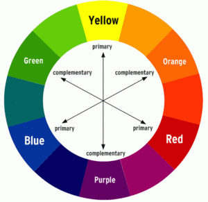
Complementary colours are any two hues positioned exactly opposite each other on the basic colour wheel.
The above diagram shows red and its opposite colour green, blue and its opposite orange and finally yellow and its opposite purple. There’s an unlimited variety of colour mixtures, tints, shades and tones that can be achieved using any two pairings.
What is significant about complementary colours?
These pairs of colours form a special relationship. When positioned next to each other, one enhances the other, making it look more vibrant. This special phenomenon is referred to as ‘Simultaneous Contrast’.
What are the mechanics behind this?
Essentially the vibrancy of the colours on the colour wheel are such that all the warm colours (red, orange, yellow) are on one side, with the cooler and more tranquil colours (green, blue, purple) on the other. Therefore any opposite pairing always constitutes one warm and one cool colour. Furthermore, the two opposite colours are always a combination of the three primary colours, meaning one completes (or complements) the other.
For this reason, two opposites will always neutralise each other, if mixed together.
Using this to our advantage in web design
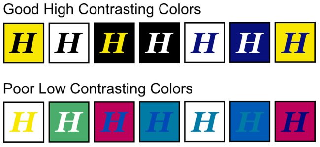
So how does this apply to web design? Well, essentially this Simultaneous Contrast phenomenon can be used strategically in the web designers advantage. By using high contrasting colours for specific web elements, the user's attention can be drawn to targeted key information. Or for example, finding the right balance between the background colour and the web content. Contrast directly impacts readability and legibility and is thus essential for usability. The diagram below shows the good and bad practice of this principle:
The Emotional Implications of the Vibrancy of Colour
It has been recognised since the middle ages that there is a clear link between emotions and colours. It is therefore in a web designers interest to exploit this fact, by creating the right mood and atmosphere with respect to the context and goals of their website. It is worth noting at this time that different countries and cultures perceive colour in different ways. The following connections are with respect to recognised principles within the western world and analyse psychological research pertaining to each of the primary colours, as well as green and black.
Red
Red has long been associated with sexuality, lust and appetite. There is a wealth of research proving that we are biologically primed to respond to red in a powerful, visceral way. Historically woman have been beautifying themselves with red and pink lipstick for 12,000 years. On valentines day millions of red cards and flowers are sent. There is evidence to suggest that it is the saturation not the hue of the red that causes these effects.
Studies have also shown that red can raise your heart rate, make you hungry and increase your chance to win in sports teams (shirt colour). However, this is because we also perceive red as danger in some natural situations, which can elicit avoidance.
It is unknown precisely how much of the effect red has on our emotions is down to nature or nurture. But one thing is for sure, red is a very powerful colour that causes a great reaction in humans. It is advised to do your research if you decide to use red in web design, such that you elicit the desired emotional response with your users.
Blue
Widely regarded as one of those rare colours that have a universal appeal. It is generally regarded as being a calming, relaxing, pleasant and relaxing colour. It is therefore used frequently by large multinational companies (like IBM), some of the largest social media companies in the world (Twitter, Facebook, LinkedIn…) and is a very common colour of choice for corporate entities such as banks and lawyers. This is to effectively build trust, security and/or a sense of wealth.
The origins of this psychological bias towards blue stems back to a 1972 study on young American students. Blue is regarded as an anathema to red in many regards, stimulating creativity, making objects feel lighter, surpassing appetite and even lowering blood pressure. Amazingly it can influence our perception of time and when used predominantly on a website can give the illusion of increased connection speeds (due to its relaxing impact).
This tendency to prefer blue may originate from our natural world and physical environment, with large expanses of blue sky and sea.
Yellow
Like Red, Yellow can have an arousing and stimulating effect on its viewer. It is regarded as a warm and happy hue, associated with brightness and the sun.
However, it also has a fickle side, possibly due to the fact it can elicit danger in nature (wasps, snakes etc)
Yellow is the least liked hue. It is often used to draw attention, whether on road signs or online, as it is often regarded as being brighter than white.
Green
Green can have diverse psychological effects depending on its tone. Primarily associated with nature (and therefore relaxation), darker greens can also represent status and wealth. Green breaches the gap between warm and cool colours, though tends to be regarded more of a cool colour. Thus it has the same relaxing effects of blue but retains some of the energising qualities of yellow.
Green can be used to suggest growth, and stability and can fit in with financial and environmental themes.
Black
In the western world, black can be associated with darkness, sophistication and death. It is also used to denote wealth, prosperity and sophistication.
In web design, it can be used to convey formality and seriousness.
Conclusion
The importance and impact of colour choice in web design is easily overlooked. No matter what colour you pick, it will have a direct impact on the mood, design and feel of your website overall. Contrast and colour choice must be researched and well thought out to maximise readability, legibility and the desired emotional response from your users.

No comments.